# 启发式评估 Heuristic evaluation - Jakob Nielsen
Jakob Nielsen的启发式可能是用户界面设计中最常用的可用性启发。Jakob Nielsen 开发了启发法,基于在1990年与Rolf Molich一起工作的内容。由Nielsen于1994年发布的最终版启发规则至今仍在使用。 发表在尼尔森《Usability Engineering》书中的启发如下:
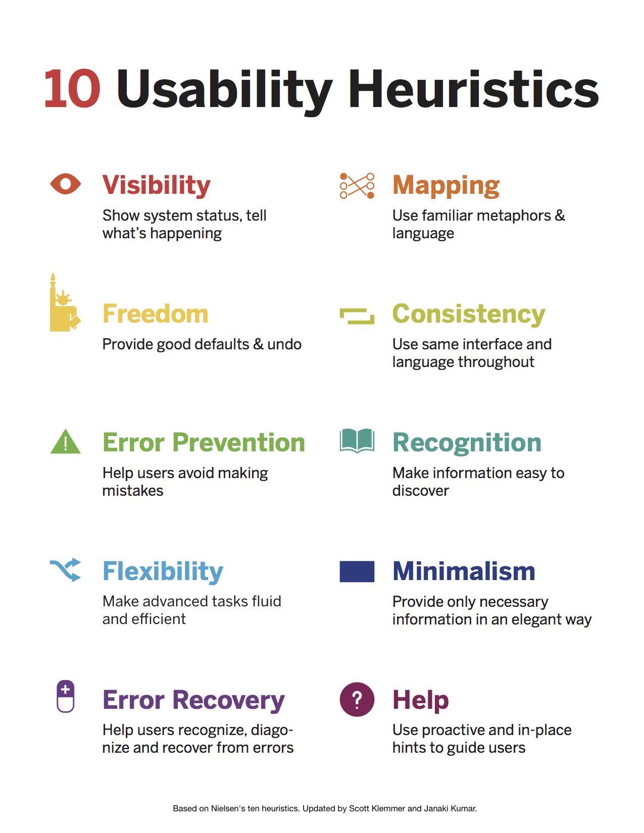
系统状态的可见性
系统应始终保持用户了解正在执行什么,通过合理时间内的适合反馈。
匹配系统和现实世界
系统应该使用符合用户习惯和用户熟悉的语言,包括术语、概念等等。而不是使用以系统为中心的术语。系统应该遵循现实世界的惯例,让信息以更自然和符合逻辑的顺序出现。
用户控制和自由
用户有时会不小心错误地选择系统的功能,因此需要一个清楚的“紧急退出”去退出与期望不符的场景,而非经历整个对话。应该能支持撤销和恢复。
一致性和标准
用户不应该考虑不同的单词、状态、操作是否意味着同样的事情。应当保持平台的统一性。
错误预防
一个事先就能预防出错的设计,要比好的错误提示信息好的多。应当在用户行动以前,就消除能诱使犯错的条件,必要时提醒用户确认操作。防患于未然。
认知,而不是记忆
- 通过让对象,动作,和选项可见来减轻用户的记忆负担。
- 用户不必去记忆不同对话框里的信息。
- 使用可见的指示或者检索来帮助用户使用系统
灵活性和利用效率
- 快捷菜单可以帮助加速专业用户和系统的交互
- 允许用户定制常用的选项
审美和逐步披露 | 简约的设计
- 用户界面上不应该包含太多无关或很少被用到的信息
- 每一个多余的信息都会减少有用信息的可见性
帮助用户识别,诊断和从错误中恢复
错误信息应该用通俗易懂的语言表达(而非代码),准确抵说明这个问题,并提出建设性的解决方案。
帮助和文档
即使不使用帮助文档系统也可以使用,提供帮助和说明文档是必要的。 任何帮助信息都应该容易被查找,关注用户任务,列出具体的步骤去完成任务而不是只给大方向。
Heuristic evaluation 原文
Jakob Nielsen's heuristics are probably the most-used usability heuristics for user interface design. Nielsen developed the heuristics based on work together with Rolf Molich in 1990.The final set of heuristics that are still used today were released by Nielsen in 1994. The heuristics as published in Nielsen's book Usability Engineering are as follows
Visibility of system status
The system should always keep users informed about what is going on, through appropriate feedback within reasonable time.
Match between system and the real world
The system should speak the user's language, with words, phrases and concepts familiar to the user, rather than system-oriented terms. Follow real-world conventions, making information appear in a natural and logical order.
User control and freedom
Users often choose system functions by mistake and will need a clearly marked "emergency exit" to leave the unwanted state without having to go through an extended dialogue. Support undo and redo.
Consistency and standards
Users should not have to wonder whether different words, situations, or actions mean the same thing. Follow platform conventions.
Error prevention
Even better than good error messages is a careful design which prevents a problem from occurring in the first place. Either eliminate error-prone conditions or check for them and present users with a confirmation option before they commit to the action.
Recognition rather than recall
Minimize the user's memory load by making objects, actions, and options visible. The user should not have to remember information from one part of the dialogue to another. Instructions for use of the system should be visible or easily retrievable whenever appropriate.
Flexibility and efficiency of use
Accelerators—unseen by the novice user—may often speed up the interaction for the expert user such that the system can cater to both inexperienced and experienced users. Allow users to tailor frequent actions.
Aesthetic and minimalist design
Dialogues should not contain information which is irrelevant or rarely needed. Every extra unit of information in a dialogue competes with the relevant units of information and diminishes their relative visibility.
Help users recognize, diagnose, and recover from errors
Error messages should be expressed in plain language (no codes), precisely indicate the problem, and constructively suggest a solution.
Help and documentation
Even though it is better if the system can be used without documentation, it may be necessary to provide help and documentation. Any such information should be easy to search, focused on the user's task, list concrete steps to be carried out, and not be too large.
← 管理 Tog 交互设计原则 →

——《论语》