# 可视化专题
内容准备中,虽不充分,但做为基础资料分享或许对一些朋友也有所帮助。 以后相关部分会专题化维护,内容持续更新,相关题材内容根据本身性质规则分享。
# 重点推荐
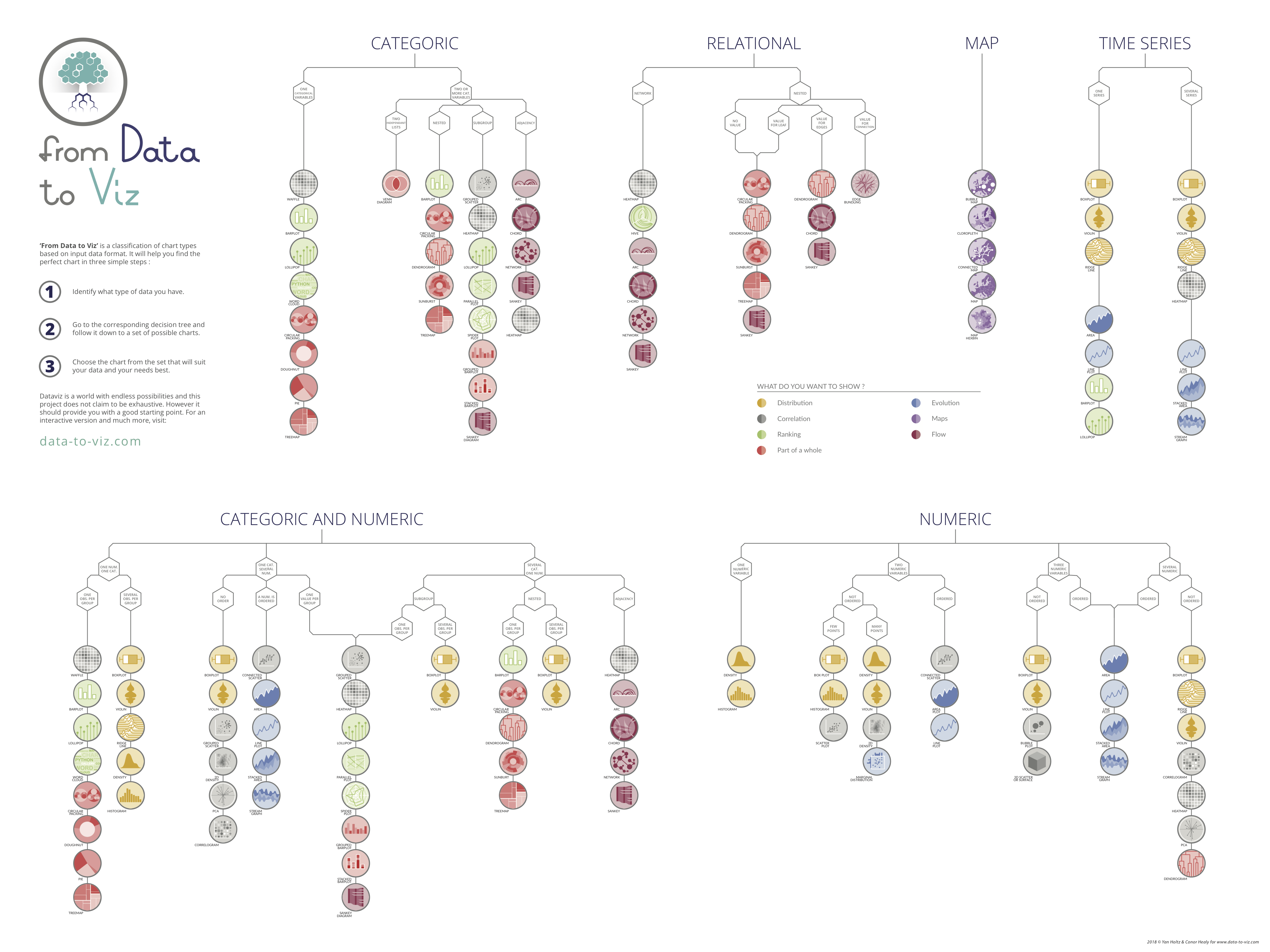
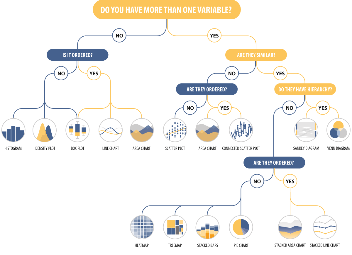
非常优秀的数据可视化网站,你可以通过决策树来选择你合适的图表,非常方便易用。 不同的是这里有各种收录的图表的基本介绍,并添加的 『常见错误』来帮助你正确的可视化数据。 并且提供了 R、python 和 D3 的示例代码[见下图];
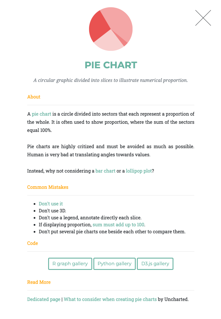
同时提供了一些常见可视化错误案例,还制作了决策树的海报,你可以通过购买海报来支持项目[见下图]。
# 选择工具
Chartlr 图表选择器 juice 图表选择器 depict 图表选择器
# 图表
了解图表应用,和图表作者的分析思路 (深入分析数据特性,有效可视化)
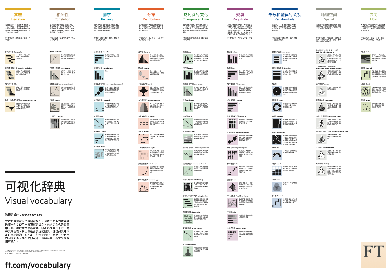
- 图表选择器 - 中文版 下载高清 PDF (英文原版) 下载高清 PDF (中文)
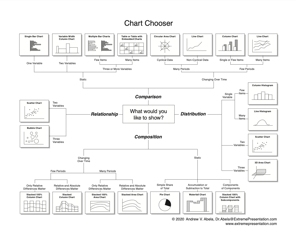
- 图表选择器 - 中文版 下载高清 PDF
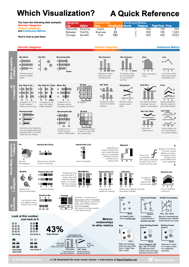
- 图表选择器 - 中文版 下载高清 PDF
# 走查表
后续会更新到 DC checklist 的 mini checlist
# GENERAL
Visualization highlights the key takeaway
- The data visualization is designed with your specific audience in mind
- Chart type is appropriate for the data – e.g. use a line chart for
demonstrating trends over time - Objects work together to clearly highlight a finding or takeaway message
- Limit the use of complex ‘fancy’ charts to avoid confusing or misleading your audience – keep it simple
# LAYOUT
Strategic arrangement of elements can make a data visualization easier to interpret
- The number of charts in the view is limited to four
- Proper use of real estate; the more important elements in the view should
take up more space - Chart axes should start at 0 (unless there’s a specific need to alter)
- The spaces between X & Y axis intervals should be even and they should be clearly labeled.
- Data is displayed in a logical order (e.g. chronological, magnitude, etc.)
- Ensure proper sizing of elements in the visualization (avoid scroll-bars, or
scrunched up charts)
# TEXT
Titles, labels, annotations, and other text forms help communicate your message
- Short and descriptive title in the upper-left corner
- Annotations highlight specific data points, as needed
- All text is horizontal
- Font type is consistent and legible
- Font size is hierarchical and readable
- Acronyms are defined
# FORMAT
Removing unnecessary elements in the view can significantly improve its quality and impact
- Gridlines are not present or muted (light gray)
- Redundant borders are removed
- Axes tick marks are used with appropriate spacing
- Values are formatted to a suitable level of precision (round up) and apply applicable display units (e.g. thousands, currency)
- Currency symbols are used, when applicable
- Graphs are 2 dimensional; avoid 3D or shape bevels
- Any icons or images are used to support interpretation
- Data legends (color, size, or shape) are positioned near the relevant data and used sparingly
# COLOR
Proper use of color will help tell your data story; while a poor one will confuse or distract your audience
- Color is used to highlight key patterns and guides the viewer
- Supporting data is muted (light gray)
- Patterns are still viewable when printed in black and white
- Color scheme is intentional (e.g. in line with brand)
- Color is legible for people with colorblindness
- Culture-laden color connotations have been considered
- Not more than 5 colors are used in the visualization
- Consistent color is used for same variables
- Gradient diverging color palette is not used for categorical data nor for background
- Sufficient contrast exists to ensure readability
# 网站推荐
# 书籍推荐
等我看完的
# 相关阅读
- 数据之美:迄今 10 佳数据可视化示例 (opens new window)
- How to Choose the Best Types of Charts For Your Data - Venngage (opens new window)
- Choosing a good chart - The Extreme Presentation(tm) Method (opens new window)
- 可视化方法周期表 (opens new window)
- 图表选择器2 (opens new window)
- Announcing the Slide Chooser - The Extreme Presentation(tm) Method (opens new window)
- depictdatastudio (opens new window)
- chart doctor (opens new window)
- flowingdata chart chooser (opens new window)
- data to viz (opens new window)
- How to Choose the Right Chart - Qlik Community - 1717241 (opens new window)
← Sketch data 色板 →

——《论语》